Your New Monitor's Hidden Problem: Beyond 'Vivid' Colors

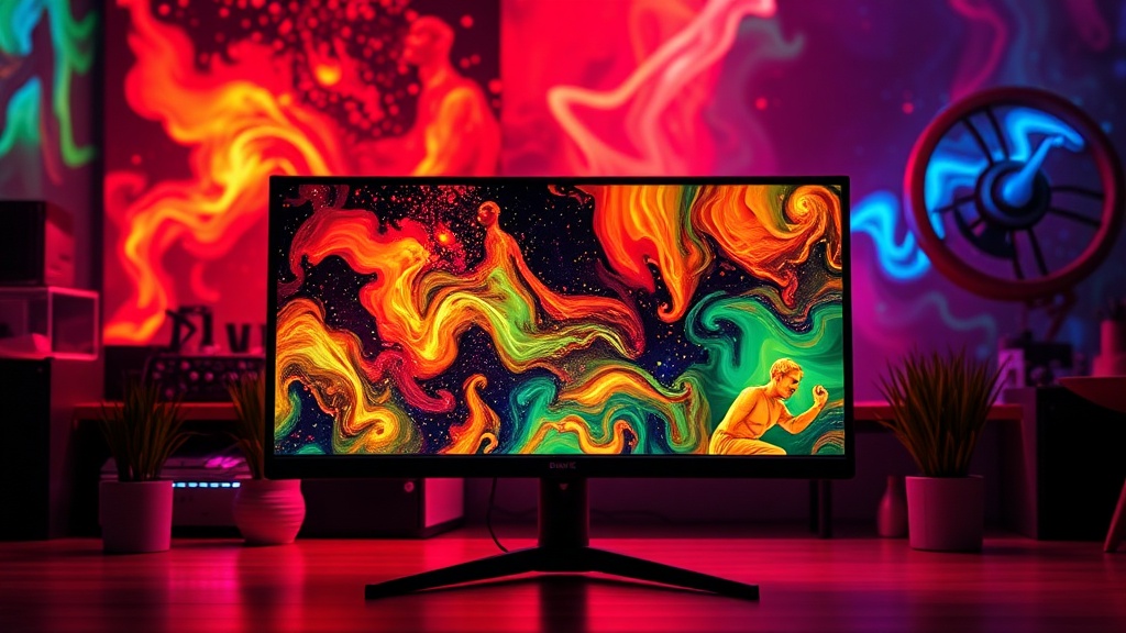
When you unbox that shiny new monitor, the marketing promises pop-off-the-screen colors and incredible clarity. But what if the "vivid" experience feels less like accurate imagery and more like a headache-inducing assault on your retinas? Many manufacturers crank up brightness, saturation, and contrast out of the box. They're optimized for a brightly lit retail floor, not for delivering true-to-life visuals for your work or entertainment. Understanding a few basic settings can drastically improve your viewing experience—and save you from upgrading hardware unnecessarily.
What's really going on with monitor colors and why do they look "off"?
That "pop" you see on the showroom floor often comes from exaggerated factory presets. Displays are calibrated to grab attention, pushing color temperatures to icy blues, blowing out highlights, and crushing blacks. Your monitor's